
This talk was presented at the Scholarship of Teaching and Learning 2009 Conference
Showing posts with label HCI. Show all posts
Showing posts with label HCI. Show all posts
Tuesday, April 28, 2009

HCI & Web 2.0 Lingo
In the human computer interaction (HCI) field there is a debate between the psychologists and the computer scientists about whether the human should be put before the computer (HCI) or the computer before the human (CHI) Norman . Norman claims that HCI emphasizes the human and reminds designers that the computer should serve and work for the human.
In a similar fashion Ray Rose in his eLearning Evangelist blog claims we should "do away with Web 2.0 in education" and instead replace it with the term "Learning 2.0". Like Norman, Rose is careful with his language in order to put the emphasis on education and learning rather than the tools that will inevitable change.
In a similar fashion Ray Rose in his eLearning Evangelist blog claims we should "do away with Web 2.0 in education" and instead replace it with the term "Learning 2.0". Like Norman, Rose is careful with his language in order to put the emphasis on education and learning rather than the tools that will inevitable change.
Sunday, April 5, 2009
Reflections on the Digital Divide

I like Wikipedia 's definition
"The term digital divide refers to the gap between people with effective access to digital and information technology and those with very limited or no access at all."
Because of that key word "effective" access. I am glad to see that we are not simply looking at whether or not all have access.
I also agree Jacob Nielsen's Digital Divide: Three Stages framework.
Stage 1: Economic
However with the One Laptop Per Child $100 Laptop and Walmart & Google partnering to make a $200 desktop , I don't foresee this to be as big of a problem as time brings the price of hardware down and software becomes free with the rise of free and open source software and cloud computings free Web 2.0 Apps.
Stage 2: Usability
Design principles like Ben Shneiderman's Universal Usability have helped made it easier for averages to access and use the web but there is still more work to be don. Nielsen also argues literacy skill also should be considered. I would add digital literacy skills are another area that prevents users to maximize effective use of the web.
Stage 3: Empowerment Divide
I think this is the most critical area. It is not just an access and usability gap but I think the greatest digital divide is in the participatory gap. It is sad when we have all this power at our fingertips and most don't use the web in ways that can really empower and enhance their lives. Web 2.0 has begun to transform the web from a read only to a more read write web .
Final Thought:
I see education as our only hope to break this digital divide. Schools need to start looking at digital literacy as just as important as reading, writing, and arithmetic.
More about on Digital Divide
Click here for a great collection of Digital Divide writings
View this slidecast
Watch this video
Because of that key word "effective" access. I am glad to see that we are not simply looking at whether or not all have access.
I also agree Jacob Nielsen's Digital Divide: Three Stages framework.
Stage 1: Economic
However with the One Laptop Per Child $100 Laptop and Walmart & Google partnering to make a $200 desktop , I don't foresee this to be as big of a problem as time brings the price of hardware down and software becomes free with the rise of free and open source software and cloud computings free Web 2.0 Apps.
Stage 2: Usability
Design principles like Ben Shneiderman's Universal Usability have helped made it easier for averages to access and use the web but there is still more work to be don. Nielsen also argues literacy skill also should be considered. I would add digital literacy skills are another area that prevents users to maximize effective use of the web.
Stage 3: Empowerment Divide
I think this is the most critical area. It is not just an access and usability gap but I think the greatest digital divide is in the participatory gap. It is sad when we have all this power at our fingertips and most don't use the web in ways that can really empower and enhance their lives. Web 2.0 has begun to transform the web from a read only to a more read write web .
Final Thought:
I see education as our only hope to break this digital divide. Schools need to start looking at digital literacy as just as important as reading, writing, and arithmetic.
More about on Digital Divide
Click here for a great collection of Digital Divide writings
View this slidecast
Watch this video
Universal Usability Design
Ben Shneiderman has claimed one of the key features of usability design is universality. In other words, high quality designers build an interface that is so universally usable that it is accessible and successful for over 90% of all households.
Read more here from Wikipedia
Read more here from Wikipedia
Monday, March 30, 2009
Gmail Vs. Yahoo Email
Rules: Using Jakob Nielsen 10 Usability Heuristics
1. Visibility of system status
Winner: Gmail has a much quicker response time and has and offline/online status indicator.
Looser: Yahoo is slow and clunky and does not have an offline feature
2. Match between system and the real world
Tie
Gmail left the hierarchical folders and uses labels instead which allow you to file one email with multiple labels rather than moving to one place in a sub folder. This matches the way humans categorize but requires all users to shift paradigms which can be confusing at first.
Yahoo uses the familiar folders systems which are easy and simple
3. User control and freedom
Winner: Gmail has a "back to inbox" and an "undo" button that take the fear out of making mistakes or getting lost
Looser: Yahoo doesn't have either
4. Consistency and standards
Winner: Gmail has the same user-interface for all of its different services and simple is their design standard.
Looser: There is no Yahoo theme
5. Error prevention
Winner: Gmail saves deleted email until you empty the recycle bin for extra redundancy
Looser: Yahoo has slyly placed adds throughout the user interface to trick users to click on them
6. Recognition rather than recall
Winner: Gmail provides several effective ways to retrieve your email, multiple labels (as discussed above) and Google's powerful search applied to your inbox
Looser: Yahoo's search is no where near as effective and with folders there is only one place the email could be.
7. Flexibility and efficiency of use
Winner: Hit the ? key any time and a transparent shortcut menu will overlay to promote shortcut use. Also with Google labs you can customize and tailor your layout and your shortcuts.
Looser: Although they both have shortcuts, Yahoo doesn't have the quick cheat sheet and you can't customize.
8. Aesthetic and minimalist design
Winner: Google's brand and logo is based on being elegantly simple or you could change your theme.
Looser: Again the desperate and annoying advertisement ruin it.
9. Help users recognize, diagnose, and recover from errors
Winner: Google won't allow you to make a mistake, if you can’t use the button it grays out
Looser: Yahoo
10. Help and documentation
Winner: Google has outsourced their help to it's "prosumers" (producer+consumers since they have a big stake in feedback and the perpetual beta). The discussion boards are very active.
Looser: Yahoo
OVERALL
Usability Hall of Fame Website = Gmail
Usability Hall of Shame Website = Yahoo
Thursday, March 19, 2009
My Search for Usability Design
Is Design = Usability?
Design --> Usability?
Design=Form and Usability=Function?
Are there any models for social usability?
I have been twisting my brain searching for the answer to the question "What is usability?" In this philosophical search I am reminded of the quest to define "What is quality?" in the book Zen & The Art of Motorcyle Maintenantance. Is there "a" answer?
I have been searching the research literature to find what the scholars say. In the Human Computer Interaction field Jacob Nelisen system acceptability model (see fig below) and Ben Schneirdman's universal usability are the recent experts on the topic.
Here is a concept map of Nielsen's framework

Jeng's What Is Usability in the Context of the Digital Library and How Can It Be Measured? (2005) prepared this literature review chart of the what others name as the attributes to usability.

Design --> Usability?
Design=Form and Usability=Function?
Are there any models for social usability?
I have been twisting my brain searching for the answer to the question "What is usability?" In this philosophical search I am reminded of the quest to define "What is quality?" in the book Zen & The Art of Motorcyle Maintenantance. Is there "a" answer?
I have been searching the research literature to find what the scholars say. In the Human Computer Interaction field Jacob Nelisen system acceptability model (see fig below) and Ben Schneirdman's universal usability are the recent experts on the topic.
Here is a concept map of Nielsen's framework

Jeng's What Is Usability in the Context of the Digital Library and How Can It Be Measured? (2005) prepared this literature review chart of the what others name as the attributes to usability.

Wednesday, March 4, 2009
Wednesday, February 25, 2009
Netbook Usability Review
 Netbook Nightmare: My Experience With the Sylvania g Netbook: February 13, 2009
Using Don Norman's priciples for the "Design of Everday Things", it appears the interface failures are primarily due to design constraints. The netbook designers have not found the right balance for the cost/benifit contraints of the physical size of the netbook. For example, it seems as they might have gone to small to be effective and efficency with the touchpad causing users to make the portable device more clunky by forcing users to plug in an USB mouse. Secondly, Martin talks about a nightmare process of updating the Linux OS drivers and updates. Norman would argue this could be culturual/logical constraint to average mainstream users who are unfamiliar with Linux and culturally programmed and logically familiar with an Apple or Windows operating system.
My questions:
1) It is not a matter of if but rather when the bugs get worked out and this class of cheap computers hits mainstream in particular our schools how will it transform education when parents starting buying their kids these new "school supplies" to bring into the classroom?
2) Why doesn't Linux make more effort to design their usability interface to meet average main stream users to assist them in crossing over?
See Also:
Don Norman's Design Principles a roll up lectures, powerpoint, resources on his work
Tuesday, February 24, 2009
Don Norman's Design Principles
Don Norman: The Design of Future Things Video Lecture
Good short summary Don Norman’s design principles
His 5 principles of visibility, natural mapping, constrain, feedback, and conceptual map prove to be an effective framework to review and evaluate a design.
Good 19 Slide Power Point Summary Design of Everyday Things
Friday, February 20, 2009
Tuesday, February 10, 2009
Friday, February 6, 2009
HCI Courses At MIT
Thanks to the MIT OpenCourseWare and the Electrical Engineering and Computer Science Department:
6.831 User Interface Design and Implementation is an graduate level course that was taught in the Fall 2004
6.883 Pervasive Human Centric Computing (SMA 5508) is an graduate level course that was taught in the Spring 2006
6.831 User Interface Design and Implementation is an graduate level course that was taught in the Fall 2004
6.883 Pervasive Human Centric Computing (SMA 5508) is an graduate level course that was taught in the Spring 2006
Thursday, February 5, 2009


Thursday, January 29, 2009
Video: Web 2.0 Us/ing Us
Web 2.0 Us/ing Us
The rising trend of Web 2.0 is shifting from a human to computer interaction to human to web interactions. As the new web platform behaves more like desktops and software applications, we should shift our paradigm on how we view technology.
To read the transcript of the video click here
Wednesday, January 28, 2009
HCI Spotlight: Seymour Papert
Seymour Papert's inspiring mission statement on his site papert.org states "Empowering youth worldwide to create and collaborate online because all of us are smarter than one of us." During the 1960's Semour Papert worked under Jean Piaget and is considered his most successful protege. He is one of the most well know education and technology pioneers. Some of his greatest contributions are developing logo programming language and lego mindstorms robotics kits.
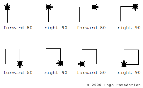
I distinctively remember during my elementary school years when Papert's Logo Tuturle art software swept into the schools. Here is some info about the Turtle Logo Language and free opensource software you can download or play in your web browser.
Unfortunately in 2006 Papert was hit by a motorcycle while he was crossing a road in Hanoi, Vietnam resulting in severe brain damage. He is now using some of the same learning tools he invented to rehabilitate his brain. For more info see In search of a beautiful mind
For more resources:
Click here for his Wikipedia entry
Click here for a collection of his writings
Friday, January 23, 2009
HCI Spotlight: Marissa Mayer
 Human Computer Interaction Spotlight: Marissa Mayer
Marissa Mayer joined Google in 1999 as the company's first female engineer (19th overall) and led the user interface and webserver teams at that time. She was the first person at Google to work exclusively on the user experience, starting in 2000. She is now the Vice President, Search Products & User Experience.
She gave a SIGCSE '08 Keynote Talk "Innovation, Design, and Simplicity at Google." You can watch the video of her presentation here
My favorite quote: When asked about Google's secret in maintaining such a simple and clear user experience she replied...
"I think Google should be like a Swiss Army knife: clean, simple, the tool you want to take everywhere. When you need a certain tool, you can pull these lovely doodads out of it and get what you want. So on Google, rather than showing you upfront that we can do all these things, we give you tips to encourage you to do things these ways. We get you to put your query in the search field, rather than have all these links up front. That's worked well for us. Like when you see a knife with all 681 functions opened up, you're terrified. That's how other sites are - you're scared to use them. Google has that same level of complexity, but we have a simple and functional interface on it, like the Swiss Army knife closed.
The utmost thing is the user experience, to have the most useful experience. It's important to differentiate between "usefulness" and "usability." At Google, we make a *useful* tool, and then we put a *usable* interface on top of that. One has to precede the other. If you have usability without a useful product, you don't really have much." -From an interview by Goodexperience.com
Thursday, January 22, 2009
Remote Beta Testing via Screencasting
I saw this video and it opened up the possibility of doing interface usability testing for beta software remotely. A user could use screencasting software to record and share their impressions and thinking process as they use software or webware.
Subscribe to:
Posts (Atom)


 Posts


